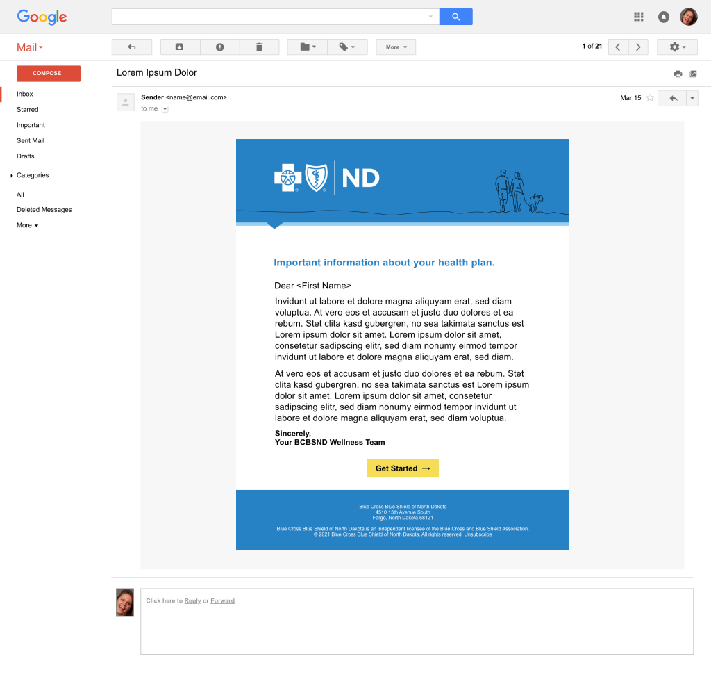
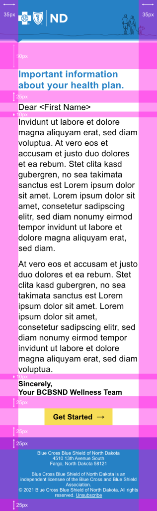
Responsive Desktop Email Design
Desktop size of email design. Developer notes outlining spacing and headings. Desktop size mockup.


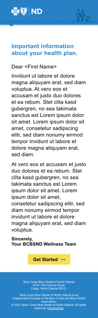
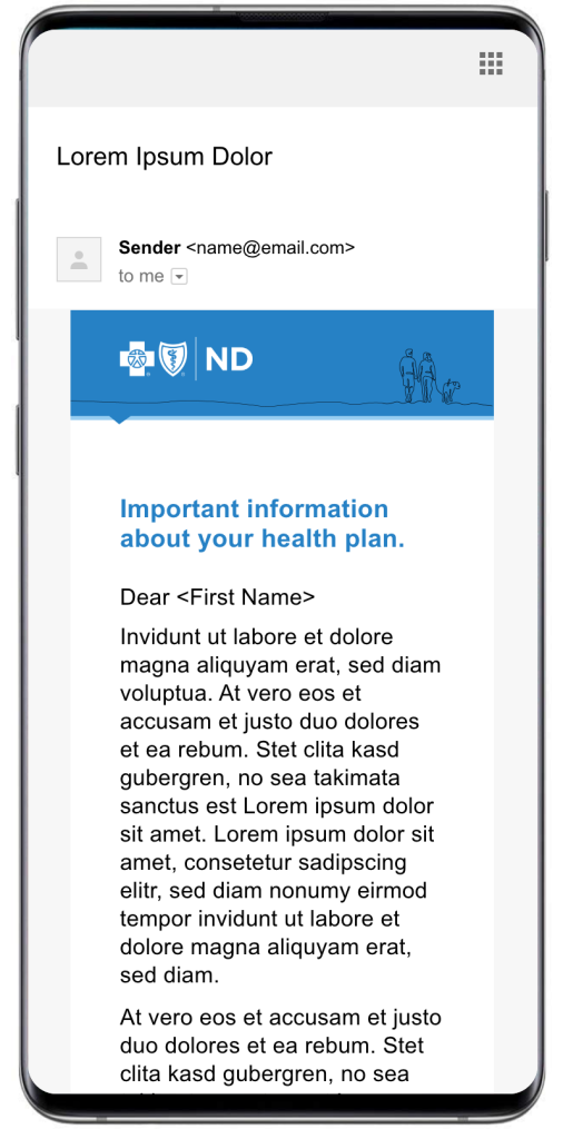
Responsive Mobile Email Design
Mobile size of email design. Developer notes outlining spacing and headings. Mobile size mockup.
Showing My Work
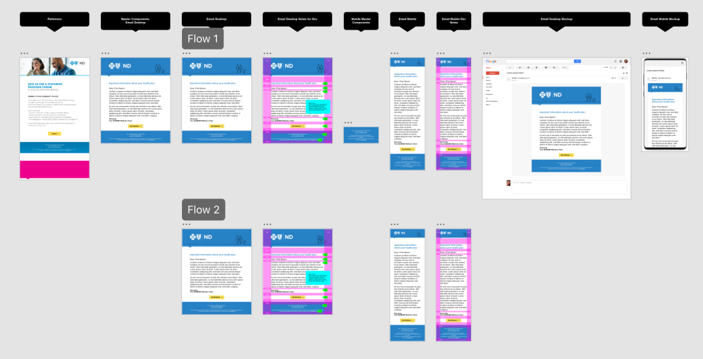
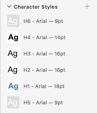
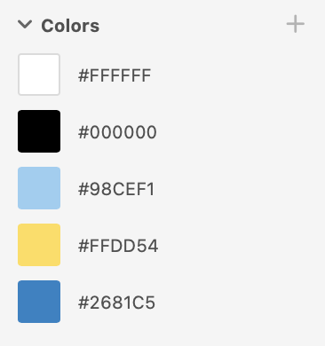
The image below is a screen shot of my file in Adobe XD. When I create for responsive design, I set up my file in a manner that is beneficial for developers and clients. First, I design desktop and mobile together, organizing the design into responsive blocks. I utilize responsive components in Adobe XD. I do the same when working in Figma. I also intentionally design with headings and other CSS tags in mind. So for example, I define my headings and paragraph styles. Then, I make sure I have my color defined in line with brand. In this case I set up two flows. The first flow is setup for the benefit of the client. They are able to see the design in mobile, desktop and then as mockups. The second flow is for the developers.